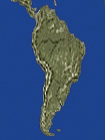
South America: the Arno what-a-lot-of-Gall-Peters projection

The sun's view of Earth in December
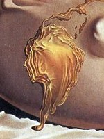
Geopolitical Child Watching the Birth of the New Man Salvador Dalí, 1943 (detail)
Some writing concerning the controversial "Peters projection" for a world map
On this page: Monmonier: "Drawing the Line" - The Peters Atlas of the World - About cylindrical projections - Area preserved! - Links
|
|
|
|
|
| ||||
|
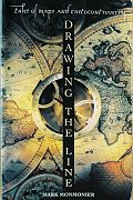
Book review "Drawing the Line" by Mark MonmonierI bought this a few years ago from Daedalus Books, and on first reading my impression was of a very uneven book. The first chapter is really gripping, but then it's downhill all the way. And if you want an extra niggle, the book is over-designed: instead of italics, the designer has chosen a sickly-ornate script face, that makes reading it a bit like listening to too much Richard Strauss. Chapter 1, "The Peters Projection Controversy," is an excellent account of the background story of how Arno Peters, actually a historian with apparently remarkably little knowledge of cartography, foisted a projection which has several defects, and was completely unoriginal, on the political-gullibles. Monmonier's book is worth buying for this chapter alone: I'll draw on it on the rest of this page, in my review of Peters' atlas, and the nitty-gritty about projections. Chapter 2 is an entertaining catalogue of ideological renamings. He starts by listing some of the placenames in America which were given in an age when racial slurs were the norm - these are being sanitised - and then goes on to discuss the related issue of colonial names, and their replacement by indigenous names, and what I suppose we would now regard as a form of "ethnic cleansing", the replacement of names in conquered territory. He makes an interesting point in the case of Cyprus: "The need to rename places is perhaps strongest among people insecure about their territory." Thus the minority Turkish sector has systematically eliminated Greek place names, while in the majority Greek sector the Turkish names manage to coexist. But as for names deemed offensive, when the prim and prudish are left to hunt for hidden obscenity, they are sure to make fools of themselves eventually. One example he gives is "Dingle Hole", which was claimed to have scatological connections ("Dingleberries"). Well, many of the settlers of America came from England, where a "dingle" is a perfectly obvious term for a sort of hollow in the woods. Then there's "Squaw Tits", a mountain in Arizona, said to be offensive both to American Indians and women in general. It's certainly a slightly vulgar expression, but I really wonder if we aren't getting carried away here. Is it supposed to be offensive to name a geographical feature after a part of the body it resembles? I instantly think of Nyuto-san, or "Nipple Mountain" that we climbed on our summer holidays in 1999. (Incredibly, I failed to photograph the eponymous feature...) Would this too be unacceptable in America, one wonders? Note: I wasn't aware of this, but apparently there is a PC campaign to eliminate the word "squaw" on the grounds of supposed obscenity. This claim appears to be groundless. See this "Dear Cecil" article. Chapter 3 concerns a jolly jape, the Vinland Map. This turned up in 1965, and was purchased for close on a million dollars by an anonymous donor for Yale University, in a distinctly shady deal. It purports to be a map drawn before Columbus' "discovery" of America, showing part of North America as the island "Vinland" as discovered by the Vikings. There are a number of features of the map which seem a bit incongruous - the Vinland part appears to be drawn in a quite different style, and is oddly detached from the supposed "Mainland" of Europe-Africa-Asia. Moreover, it seems there really is plenty of evidence that the Vikings did explore the coast of America around 500 years before Columbus, so either way the map does nothing to alter the view on who first "discovered" it. But the various ethnic factions of the American public got very worked up about it; first the Italian Americans were aroused by Yale's publication of the "book of the map" just before Columbus day, and the Norwegian Americans in turn rose to defend the Viking explorer, Leif Ericson. Many seemed to forget that the first discovery was at least 10,000 years ago. Anyway, some doubts remain, but the chemical analysis favours the theory that this was a 20th century hoax. "Boundary Litigation and the Map as Evidence" - Chapter 4 is where it starts to go downhill. Some not very gripping stuff about boundaries in rivers and things like that, and at least one highly dubious claim: "Maps are so closely entwined with Western civilization's concept of real estate that the owning, selling, and buying of land would be impossible without them." It is certainly true of Japan, where plots of land are measured to centimetre precision, but I don't think it's true of England at all. In many cases the "maps" of properties are little more than blobs, and essentially the title hangs on a description - "All that messuage or dwelling house known as and situate at Ashton House, Gloucester Street, Painswick in the County of Gloucester" sort of thing. | |||
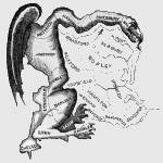
The original Gerrymander by Elkanah Tisdale |
Chapter 5 has two independent parts: first the fascinating story of the gradual acceptance of continental drift as advocated by Alfred Wegener - basically the idea that the match between the coasts of America and Africa is not accidental. The second, on geopolitics, covers the rather less interesting ideas of an Englishman, Sir Halford John Mackinder: Eurocentricity taken to extremes. Ah, yes, it's all coming back now - the last three chapters, "Maps, Votes, and Power", "Siting, Cartographic Power, and Public Access", and "Risk Maps and Environmental Hazards", I really didn't find very interesting. At least I learnt the origin of "gerrymandering": in 1812, Elbridge Gerry, governor of Massachusetts, rearranged the voting boundaries, and someone at the Boston Gazette renamed the "salamander-shaped" straggle of counties in the distorted region. All in all, a mixed bag. | |||
|
| ||||
|
A traditional atlas for comparison The Times Concise Atlas of the World (8th edition) Out of print in the USA: get it from amazon.co.uk Note: I have the 7th (US) edition, which may be slightly different. |
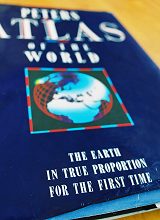
Book review The Peters Atlas of the WorldThis is an unusual world atlas. It was first published by Longman in the UK in 1989 (I was there at the time, so I got my copy for half-price), but seems to have gone out of print not very long after. While there are a number of negative things to say about this atlas, the one Really Good Feature is so astounding I feel I can say "Everyone should have a copy." The heading in the Contents says it all: The World in 43 Maps at the same Scale. These maps cover all of the earth's land surface except some tiny islands, and it doesn't matter whether you look at South East England, Japan, Nevada, Uruguay, or Outer Mongolia, the scales are instantly comparable. Each double-page spread shows 1/60 of the earth's surface: strictly it's the area scale that is constant, at 6000 sq. km to the square centimetre (average linear scale 1:8,000,000). Although notionally using the Peters projection (lines of latitude and longitude in a rectangular grid), each of these maps has the scales in the two directions adjusted to be roughly equal. So South America looks the 'right' shape, for example. And the polar regions are presented with an entirely different projection. I can't help making comparisons with the Times Atlas of the World (I have the seventh Concise Edition, US publication). Having randomly selected the countries above, I'll look up the scales used for them in the Times atlas: UK 1:3M, Japan 1:3.3M, Nevada 1:6M (also most of it also 1:3M), Uruguay 1:3.75M, Mongolia 1:12.6M (though most of it also 1:6M). Although the pure map quality is higher, after using Peters, the Times atlas is highly reminiscent of Microsoft software: the user is a nobody, and the mapmaker decides where the reader ought to want to go. The joy of maps - the ability to wander at will - is lost. I can't agree with Monmonier here: he criticises Peters because sometimes a single country is split across maps. I think this is a price well worth paying for comparability. (Link I haven't written yet: some comments about road atlases in the UK, Japan, and USA.) OK, some minuses. The biggest complaint must surely be the low standard of cartography. I recall someone with a long face walking the corridor at Longman muttering about a telex from Tokyo, and a quick inspection reveals the terrible truth. Mt. Fuji (Fuji-san in Japanese) has become the howler "Fujiyama", the island of Kyushu, is "Kiushu" (though with the correct macrons over both u's), then there's "Marioka" for Morioka, and "Sad" for Sadogashima, but "Tanega" for Tanegashima (the last two the equivalent of writing the Isle of Skye as "Sky", and the Isle of Arran as "of Arran"). And the rest of the atlas? A strange mixture of good and bad. The obvious political overtones of Peters' own foreword should raise alarm bells: questionable claims about Eurocentricity in existing maps, and the blatantly false implication that Mercator's projection is near-ubiquitous. But good ideas too: the land colouring is on the basis of remote sensing data, giving an indication of vegetated versus desert areas. And loopy ones! The only rational way to address a two-dimensional space is with x- and y-coordinates. That is why countless maps have used index reference squares, with letters perhaps along the top, and numbers down the side. One looks up "Taunton", and has to remember "page 46, E4". Arno Peters thinks this is too much, and divides each page of the atlas into macaroni strips, extending vertically from the middle of the page to the top and bottom edges, identified by single letters along the top and bottom. Thus the index doesn't directly give any idea whereabouts on the page the place is. (At least, though, the Peters pages are numbered in a single simple sequence, unlike the Times, which goes from an introductory p. 84 to p. 1, for the "real maps", then back to 1 again for the gazetteer!) Apart from the detail maps, the biggest section of the Peters atlas is the set of 246 thematic maps, all showing the whole world, naturally on the Peters projection. Some of these are fairly conventional: physical features, vegetation, climate, population, crops, hunting animals, but with an understandable social emphasis on education, health and so on. A few of these border on the dotty: it really seems a waste of a world map to show the distribution of the Shinto religion by colouring Japan brown, leaving everywhere else grey. And as Monmonier points out, Peters' obsession with "fidelity of area" doesn't provide "fidelity of population" for the maps which are supposed to illustrate social issues, leaving the 26 million people of Canada far more conspicuous than the 190 million of Indonesia, for example. Despite its many rough edges, though, this is a very useful book to have around. | |||
|
| ||||
|
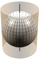
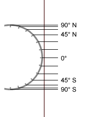
So what is this projection?The Peters projection is a particular case of a cylindrical projection: one way or another, we wrap a piece of paper in a cylinder around the earth, and unpeel the meridians onto the cylinder. Then when we flatten out the paper, the lines of latitude and longitude on the earth turn into a rectangular grid, which is one of the major conveniences of this scheme. Both north-south and east-west directions are perfectly preserved. However we do it, though, the poles will be torn apart; but that's map projections - there always has to be a compromise. Anyway, the figure below shows three obvious ways of projecting the lines of latitude onto the cylinder. The most obvious way (left figure) is to put a light at the centre of the earth, and project from it onto the cylinder. The proper term for a projection from the centre of the earth is "gnomonic", but I can't find an actual example anywhere, and my 3D software isn't up to constructing it. Though not exactly the same, this projection is very similar to Mercator's, with the problem that within 20 or 30 degrees of the pole, the land area is ridiculously exaggerated, as the parallels get further and further apart, and of course the poles themselves disappear off to infinity. For the very particular application of navigation, Mercator's projection has the useful property that a straight line on the map is of a constant compass bearing, but for any general purposes it isn't a useful projection at all (which is why it is hardly used). Perhaps the neatest way, though (centre figure) is simply to unwrap the meridians. This results in a map with a square grid of latitude and longitude. Of course it means that towards the poles wedge-shaped bits are being stretched out to a rectangle, so the shape isn't too good, but this system has the great advantage of simplicity, because the rectangular coordinates on the map are simply equivalent to the longitude and latitude. This is known as "Plate carrée" or "Equirectangular" - strictly it's an unwrapping, not a projection. (In the 3D graphics program I use (Symetrix "3D F/X"), when a bitmap is used as the surface of a sphere, it is mapped - or should I say "wrapped" - in this way, so the world map images used are in plate carrée form.) The right hand figure shows the method that the Gall-Peters projection uses: the lines of latitude are projected out to the cylinder as from infinity. (Incidentally, I made the image for the equal-area projections below by wrapping a plate carrée map around a horizontal cylinder in the 3D software. The effect is rather like taking a cylindrical photograph of the world, with a camera rotating around it, just as Andrew Davidhazy does to people, with his peripheral portraits.) | |||
| ||||
|
|
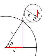
Area preserved!So here's the magic bit - it turns out that this last cylindrical projection is area-preserving. Look at the figure on the left, and consider a typical "square" - like the one shown in red - bounded by lines of latitude and longitude. This is actually from 30 to 40 degrees north, and 300 to 310 degrees east (on the coordinate system of my 3D software). Of course it's not actually a square: the lines of longitude aren't parallel, and the NS and EW dimensions are different; moreover, we really want to think about a much smaller example - an area 1 degree NS by 1 degree EW, or even 1 minute by 1 minute - and as we consider smaller and smaller sizes, the approximation to a rectangle gets better and better. It's obvious from the figure on the left, that if we consider these "squares" of a particular size in degrees, going from the equator to the pole on the surface of the earth, the NS dimension remains constant. (Roughly, 1 degree=10,000 km / 90 = 111 km) But the EW dimension shrinks, because the lines of longitude are converging on the pole. Meanwhile, look at the corresponding projected "squares" on the cylinder. These really are rectangles at least on the surface of the cylinder, and the (EW) width stays constant, but the height shrinks, as the corresponding patch on the earth's surface is inclined at a greater angle. So obviously the shape goes all to pieces, because it's being squashed in the opposite orientation to the shape on the earth's surface. Wouldn't it be nice, though, if the amount of squashing was just the same? | |||
|
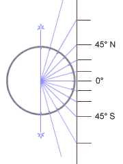
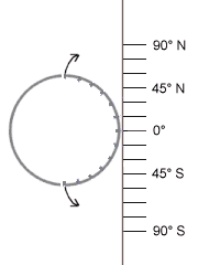
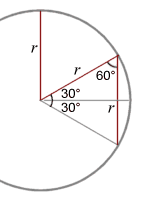
Well, it is! If you're not frightened by elementary trigonometry, look at the figure on the left. (If you are, look anyway.) This shows what happens at 57° N (the angle theta in the figure on the left). From the 3D illustration above, you can see that the EW dimension of the "square" is proportional to the distance d from the earth's axis, shown in red, and looking at the right-angled triangle, this is a proportion cos(theta) of the earth's radius r. But at 57° N the earth's surface is tilted over at the same angle of 57° N, so the vertical dimension of the "square" on the projection, p (red again) is the same proportion cos(theta) of the NS dimension on the ground g. QED. The most obvious way to do this projection is just as in the picture above: where the cylinder wraps around the equator, the shape will be right (EW and NS scales the same), and everything will simply get progressively more squashed towards the poles. This is known as Lambert's cylindrical equal area projection; it isn't used very much, partly because everywhere except the equator is stretched out sideways, resulting in an awkwardly shaped piece of paper for the map. A moment's thought will show that once we have this equal-area rectangular map, we can squash it or stretch it horizontally or vertically (as long as we do it uniformly) and since each tiny rectangle is treated the same, the map remains equal-area. Peters, and Gall before him, chose to squash the map so that the shape is right at 45° N and S. Why, is a mystery. Supposedly obsessed with unfair representation of the "third world", Peters chose to preserve shape at Turin and Montreal, leaving South America and Africa emaciated. The obvious "fair" answer, which I'm annoyed to see has been anticipated by one W. Behrmann in 1910, is to have half of the earth's surface squashed one way, and the other half the other way: this means preserving shape at 30° N and S. These are only three possibilities: I've shown them on the left, using a single image displayed at different aspect ratios. (An interesting result - half of the world's surface is between 30° N and 30° S - has dropped out from our argument. Why? C'mon, that's easy now: look at the figure on the left. Because the 60-degree angles make an equilateral triangle, all three of the red lines in the figure are of the same length r, equal to the earth's radius, or half the diameter.) As Monmonier says in his book, much of the argument in favour of the Gall-Peters projection is based on demolishing the straw man of Mercator's projection. In fact, the problems with Mercator are very widely recognised, and it is very rarely used for general-purpose maps. The other main basis of the argument is Peters' rather misleading list of "fidelities," an extremely ad hoc attempt to make his pet projection look better than the competition. He also has a rather odd claim that somehow the fact the the aspect ratio of the world map is close (1.57 vs. 1.62) to the Golden Ratio makes the map intrinsically better. Hmm. Anyway, I've listed some typical links below, but there is no substitute for looking for yourself: just search at google for "peters projection" and look through the results. | |||
|
| ||||
Links"The Peters Map" - The first hit I found on google.com: fairly typical uncritical praise for Peters (they're selling the paper map). It starts by saying that there are thousands of projections, but unsurprisingly only mentions two, naturally the (Gall-)Peters and Mercator. Among the claims is something derived from one of the "fidelities" - it asserts "The Peters Map shows equal positions." Well, yes, whatever that would mean! University of North Carolina - Material for an anthropology course discusses (yes, just two!) map projections. Claims that the purpose of Peters is "an accurate 'picture' of the world." At the top of this page are three pictures of South America, one an actual view of the spinning globe: I ask you whether Peters beats Dalí in approaching it? New Internationalist - Moderate praise; the article does point out several flaws in Peters' arguments. Thomas Wray: Contrary view: the Peters map is a "myth" - An excellent debunking article, originally published in the Canadian Geographic, 1978 Carlos A. Furuti: A dark page in the history of cartography - more useful diagrams Peter Dana: Map Projection Overview - A comprehensive catalogue of projections with examples. Includes: Unprojected (=plate carrée) - Behrmann - Gall-Peters - Mercator Mathworks Mapping Toolbox: Gall Orthographic Projection - The proper name for the "Peters" projection. Includes a useful distortion diagram. University of Waterloo (Ontario): Cylindrical Map Projections (In Japanese) Yoshiyuki Satoh: The Behrmann projection | ||||
|
| ||||
|
© Brian Chandler 2001
| |
|
From Imaginatorium Shop: Maps of Japan (real paper bargains!) Other departments
|
Brian's Bookshelf
This & That Science and Maths Nature Photography & Light Music Words |
Created May 2001 - WDG validated